QMIT
EMPOWERING ATHLETES WITH TECHNOLOGY

01 PLCO
CHALLENGE
All athletes strive to achieve the best performance, but excessive training with disregard for your physical condition often leads to injury. The goal of PLCO is to offer you the means necessary to achieve this objective. PLCO targets both individual athletes and athletes that are part of a team. This translates to features designed either for one type of user or for both.
SOLUTION
PLCO is a hybrid application made using React Native. It comes in two flavors with a light and a dark theme. The design is a mix of Eva Design System (UI Kitten) with the addition of many custom components made by myself for the most part (e.g. slider input, injury dummy, sliding list).
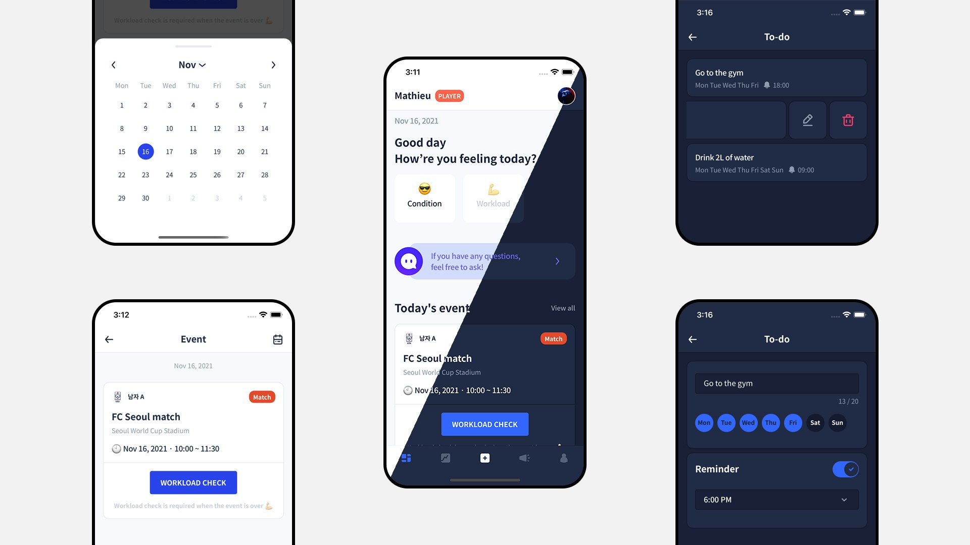
The home screen acts as a dashboard. From there you can access the most important actions such as recording your data and viewing your upcoming events and to-dos.
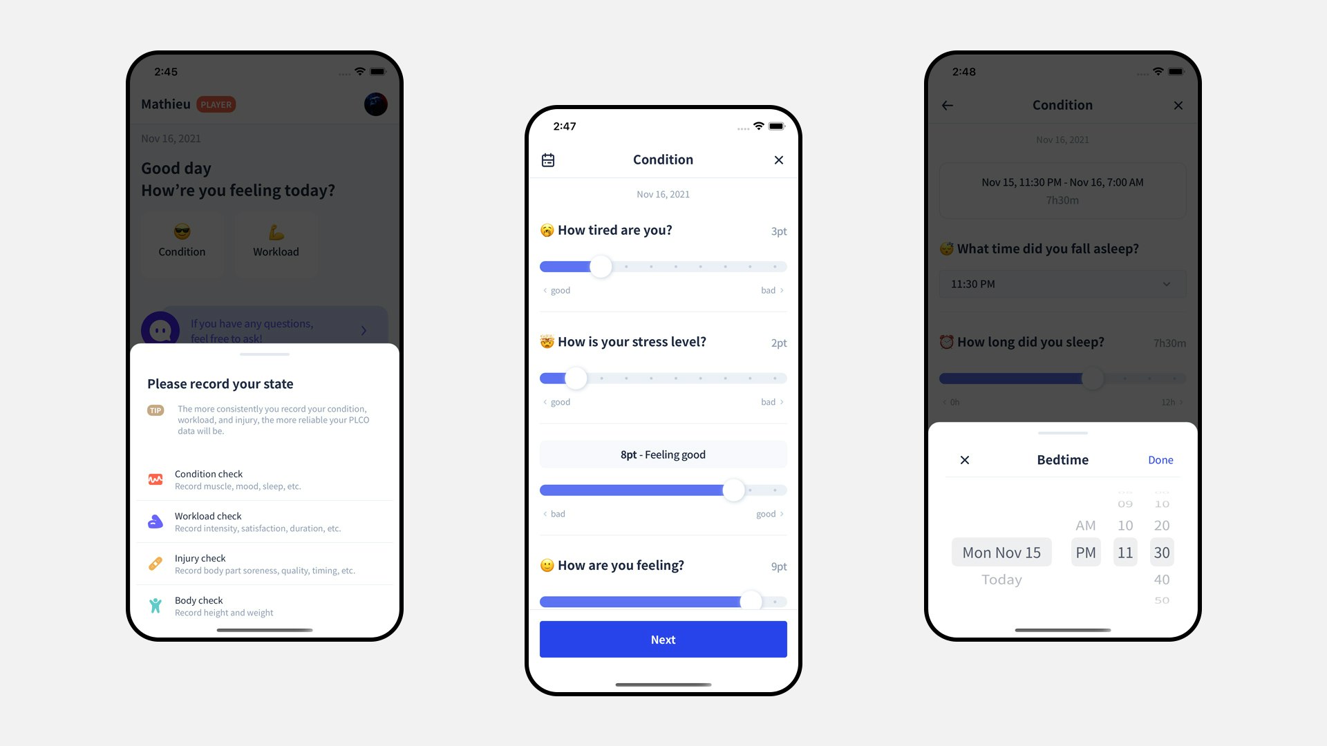
The recording is the first and most vital step in using PLCO. The more often you input your raw data, the more reliable the computed data we provide will be. The condition is expected to be registered daily. To help with that, I built a local notification scheduler and a remote notification service. Players can set up daily reminders and coaches can send reminders to all players who fail to report.
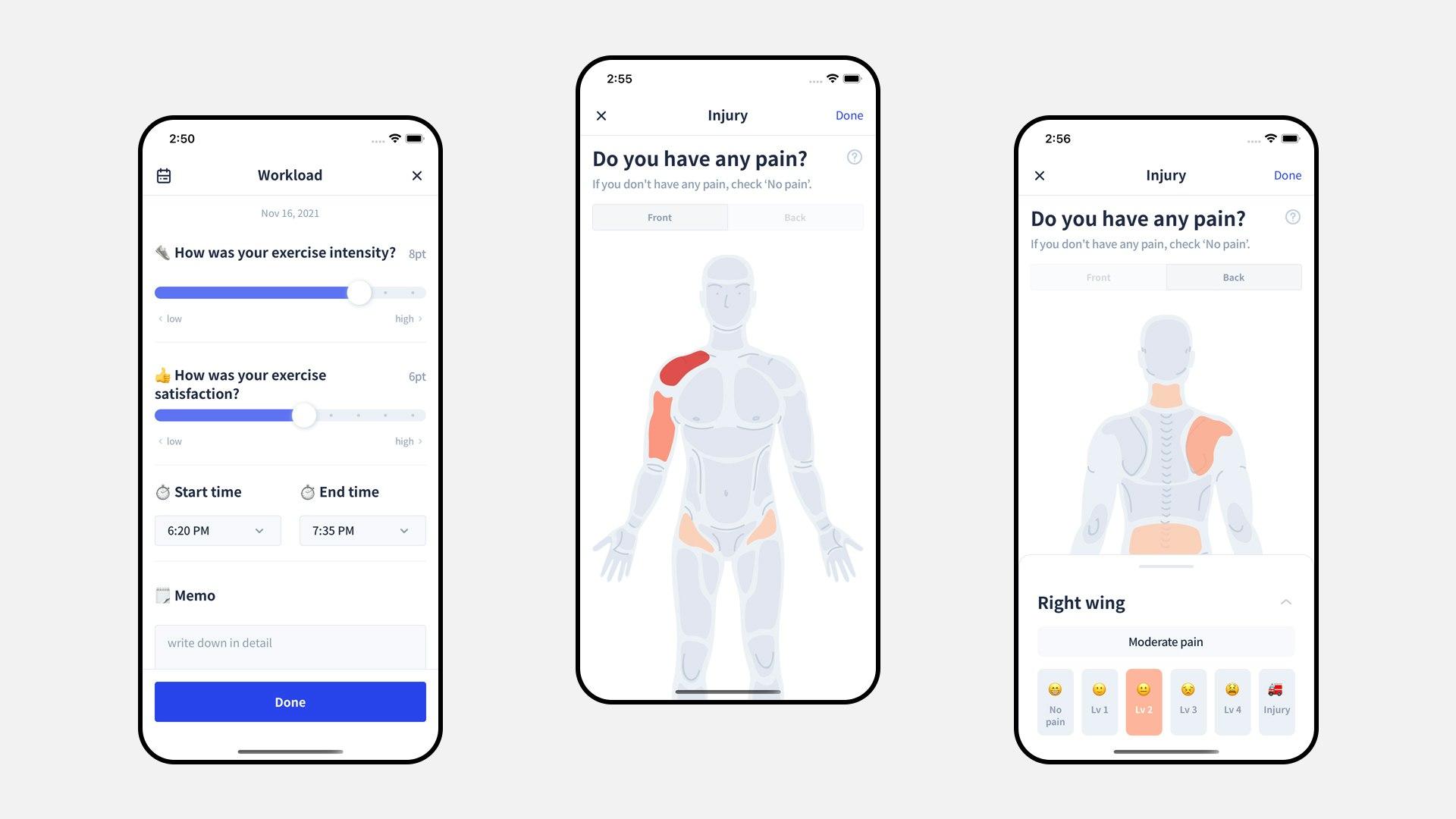
Whenever you complete a workload (e.g. training, match) you are encouraged to register it. Workload data will be used to detect undertraining, overtraining and to calculate ACWR (i.e. risk of injury). Upon completing a condition or workload input, the injury dummy shows up. Body-part by body-part, you can update your injury report to keep track of current and past injuries.
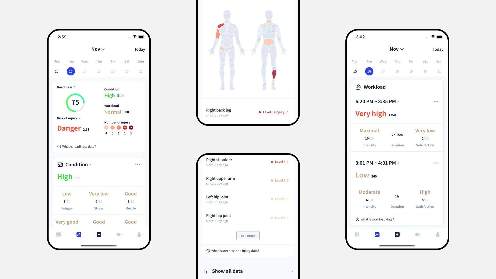
From the data tab you can view, edit and delete all previous data. Data will be presented to you in 2 formats, in it’s raw format and in it’s computed format. Computed format includes “Readiness” (i.e. overall condition), degree labels (e.g. good, normal, danger), highlights (i.e. personalized advice) and more.
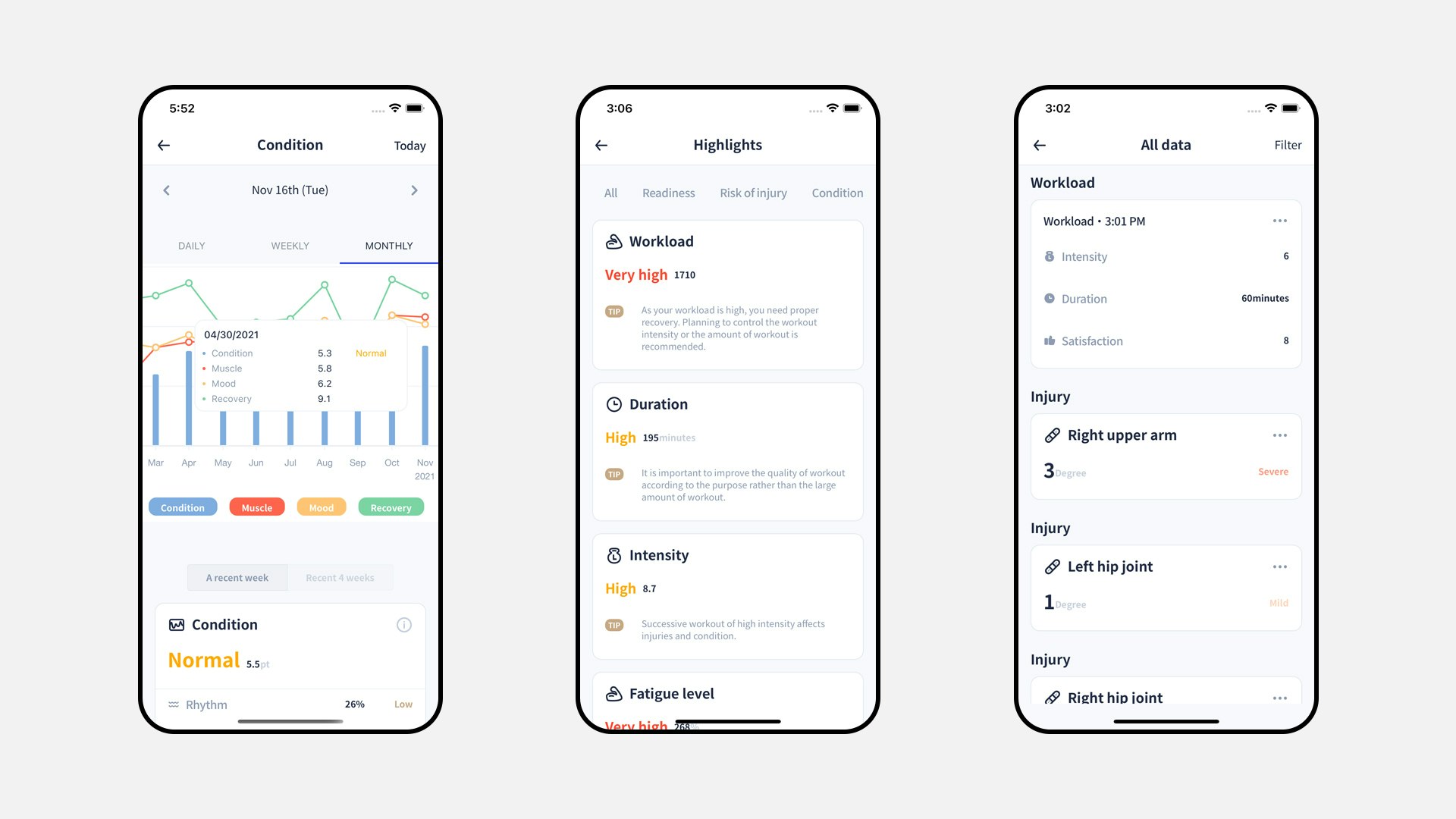
The data tab contains another depth with charts, the highlight collection and the list of all recorded data. While the top depth organizes data day by day, this level allows you to view all past data together to better grasp trends and detect issues.
RESULT
The outcome is an app that allows athletes to receive valuable feedback and guidance. Our users are able to yield the best results from training while preserving their health. All it takes is to record simple data. For coaches, PLCO is the cornerstone to their athlete monitoring system. We remove the burden of gathering all this data from players by hand. We give them more time to focus on the actual coaching.
02 PLCO for Coach
CHALLENGE
Coaches want their team to succeed and to win. To achieve it, it is critical to offer the best training while maintaining the morale and health of your athletes. First, you’ll need the tool to gather data from your players. By using PLCO they will do it for you. Then you’ll want to view your team data in a clear and informative way. You want to quickly grasp the physical and mental condition of both your team and your athletes individually. Finally, you’ll want to act on it by adjusting your training content and intensity and by communicating with your team. We aim to provide the tools for you to do it effortlessly.
SOLUTION
PLCO for Coach is a responsive web application based on a React stack. I built a custom component library and design system using Theme UI as the base design framework. Like PLCO, it offers both Korean and English language options. It is a secure access portal with granular authorization based on the type of user (e.g. team owner, head coach, physical coach).
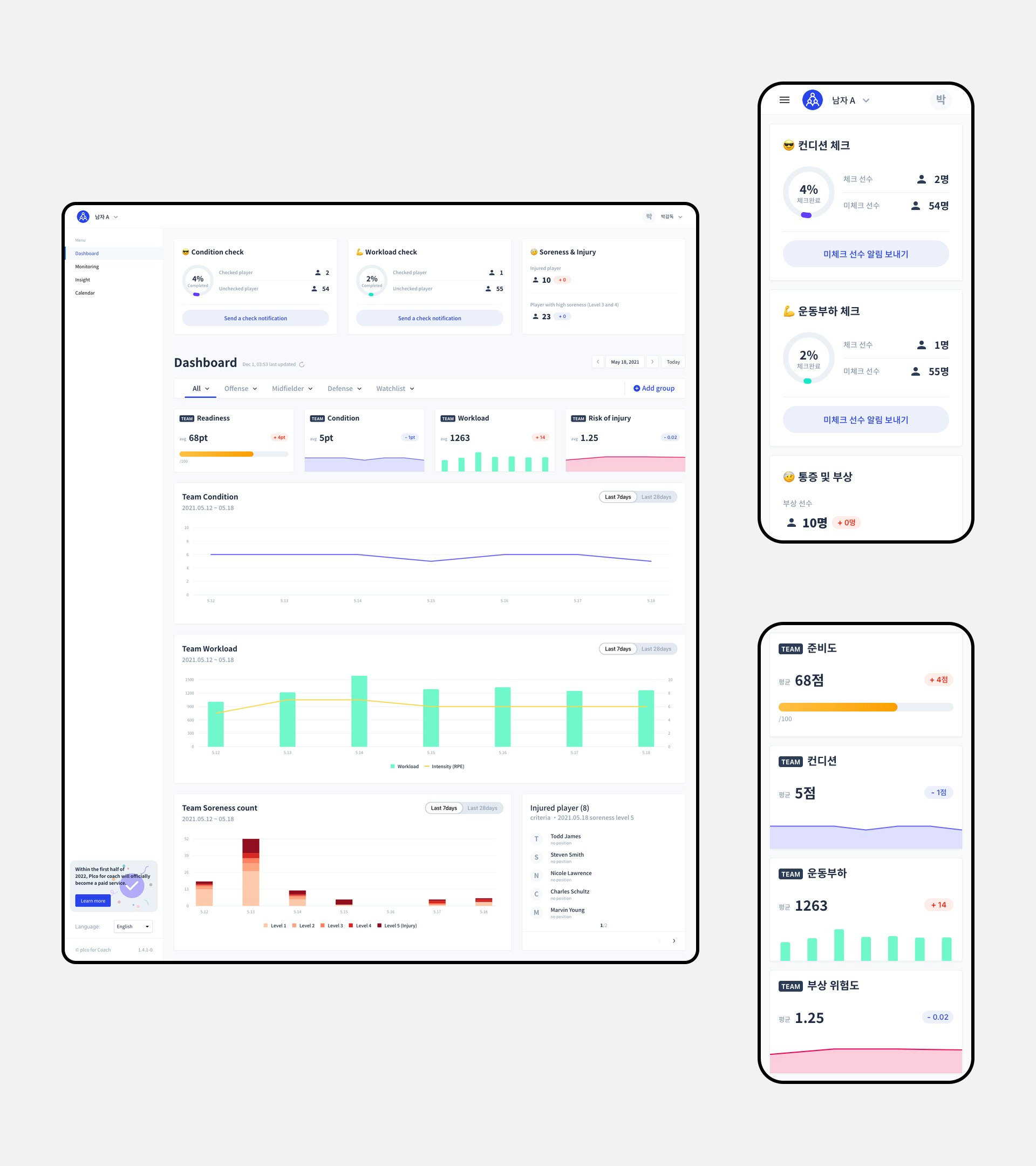
The dashboard is your entry-point to the application. The top section is here to help you ensure your players record their data. The bottom section gives you a quick glance at the 3 main components of the athlete monitoring system: your team’s condition, workload and injury state.
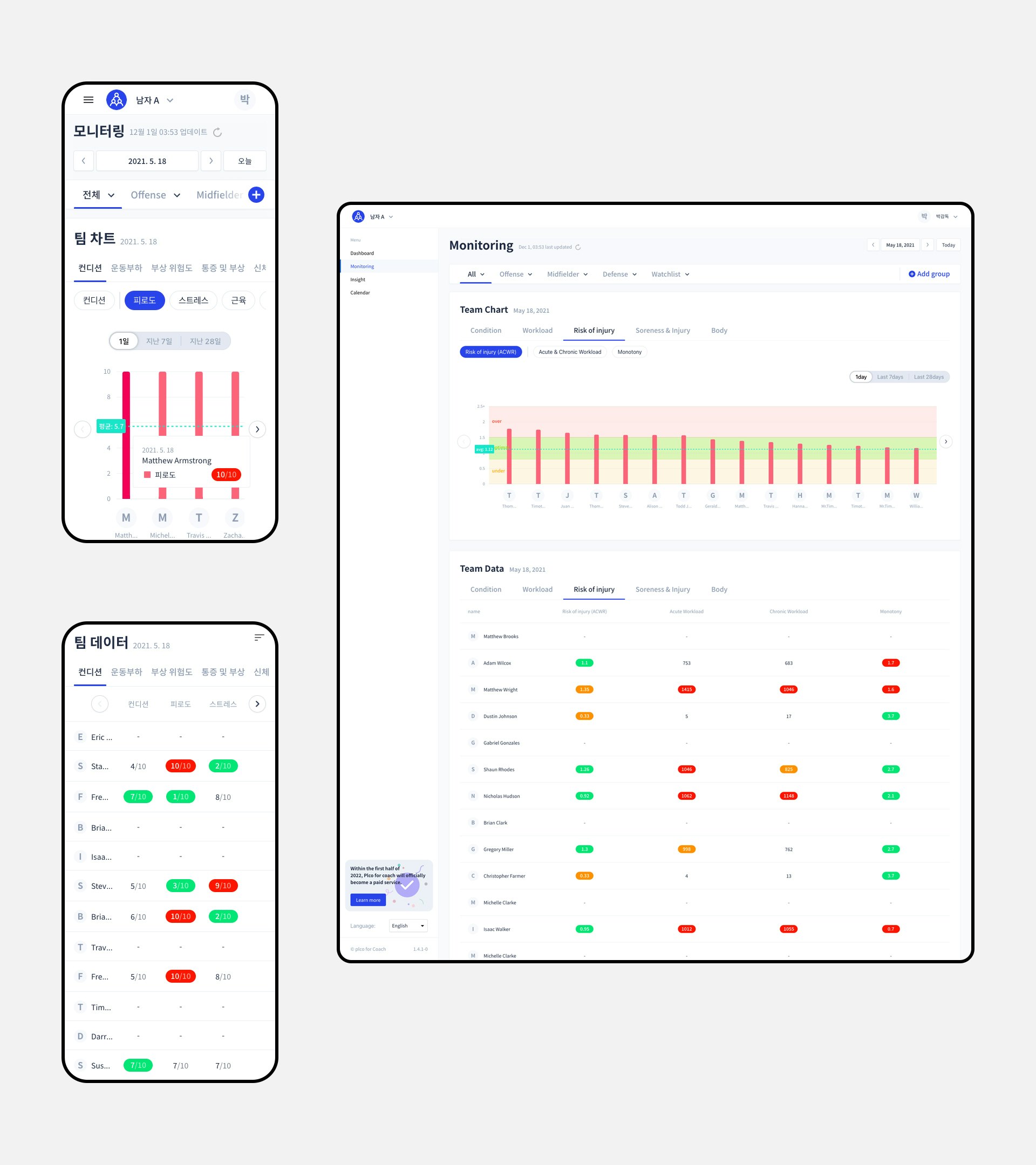
The monitoring page gives you more detailed and exhaustive information. All raw data and computed data is accessible here in both chart and table formats. You’ll find raw data such as stress level or sleep quality and computed data such as monotony (i.e. workload fluctuations) or ACWR (i.e. risk of injury).
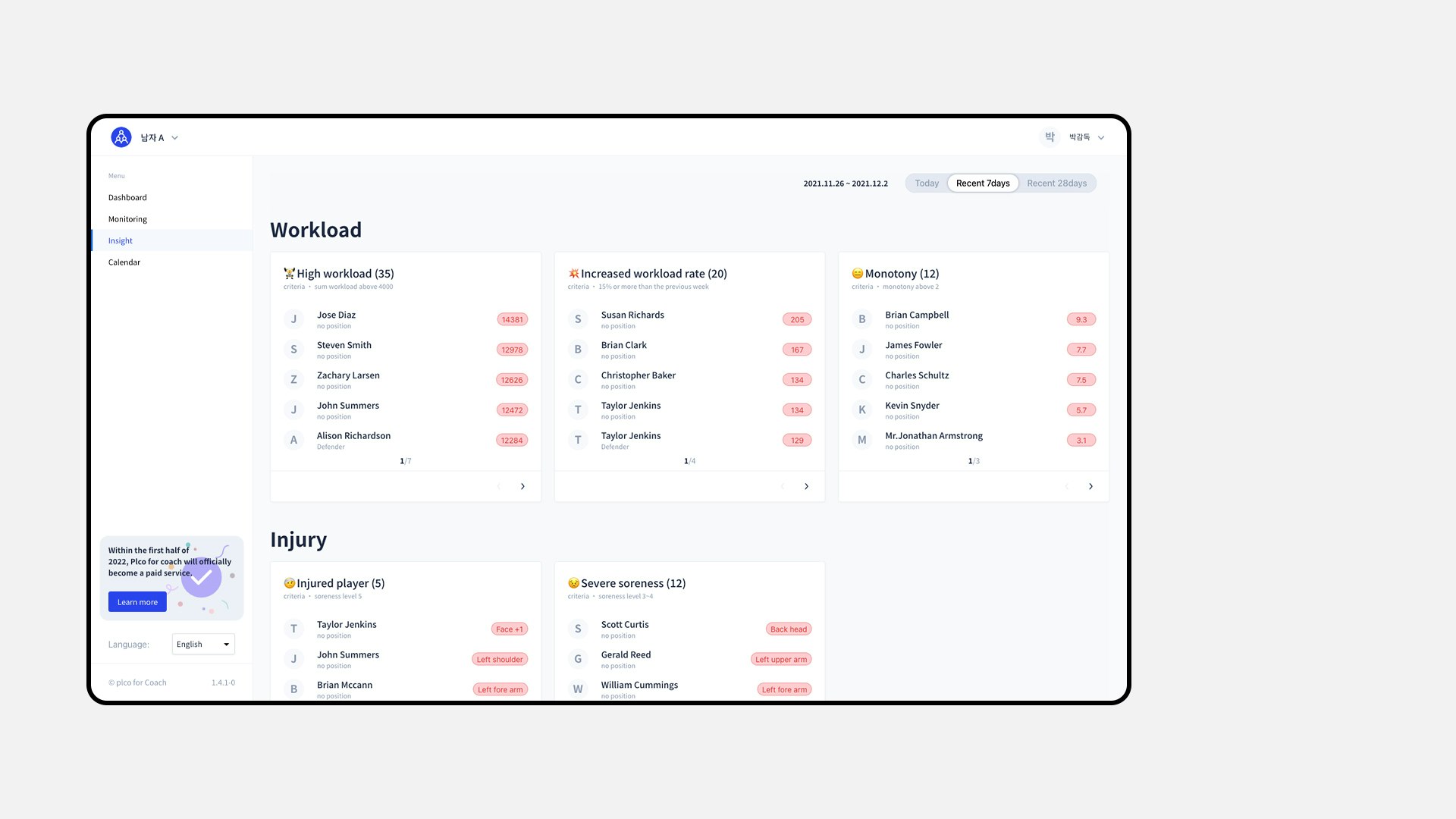
Because browsing data can be time consuming, we added the insight page to help you quickly identify anomalies. Each time period (i.e. daily, weekly and monthly) has its own relevant widgets. They expose players with issues that need to be addressed.
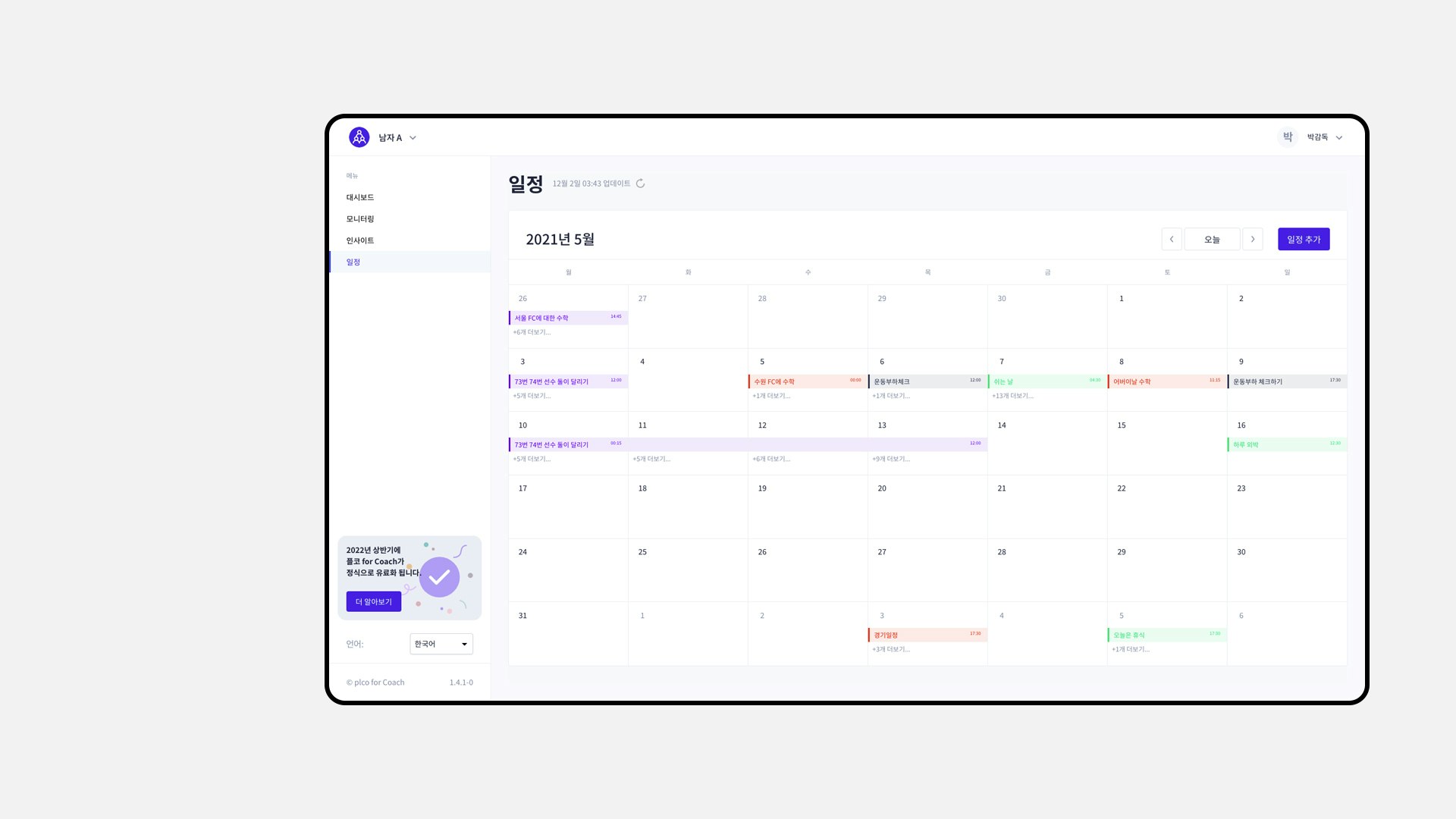
The event page works similarly to a regular calendar app except for a few differences. The first difference is that most of its features are relevant to the sport domain. Events you can create include training or matches. The second difference is that it will be directly integrated with the PLCO and PLCO for Coach ecosystem. Events will show up on the athlete's app and each event will be linked to its own recorded data.
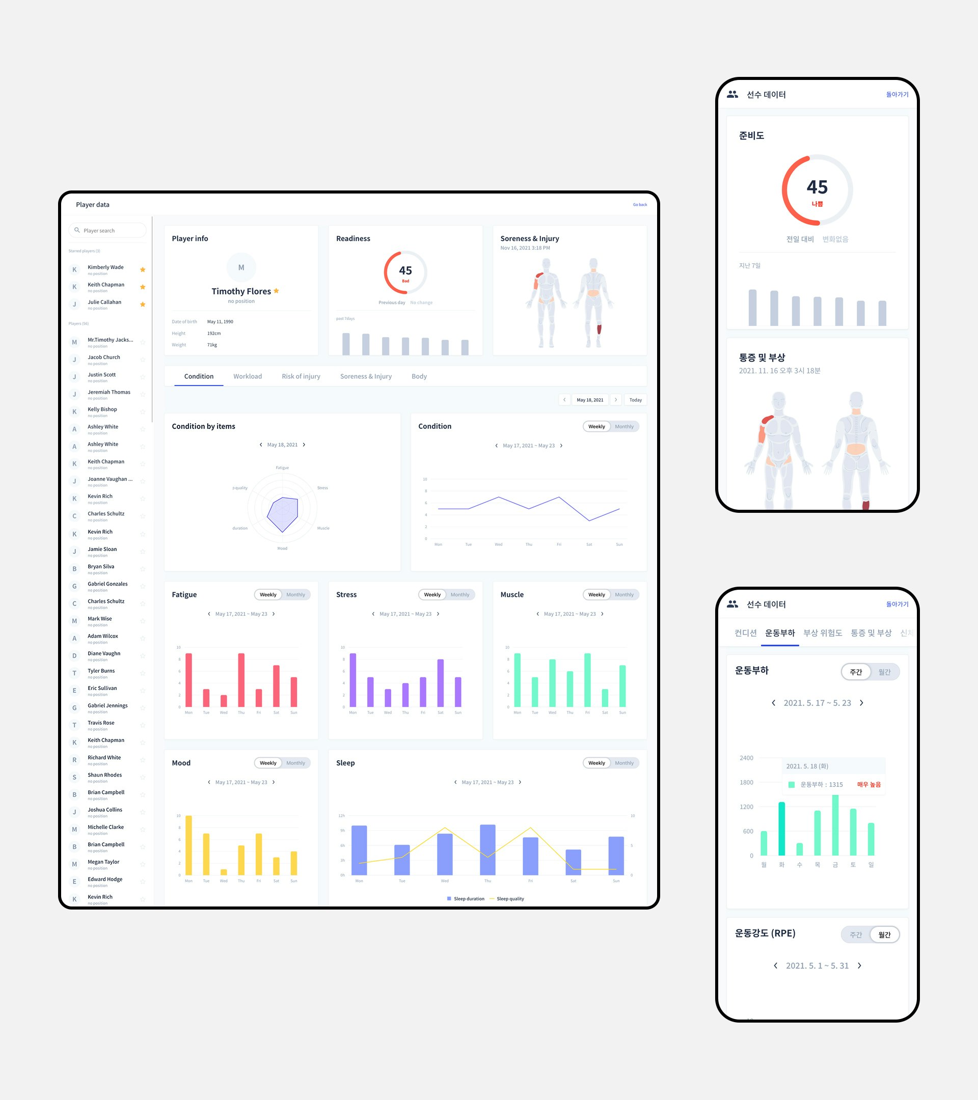
Each athlete has its own dedicated page; it gives you a clear and complete picture so you can assess its current and past state. After identifying a problem, the next step is to take action. Talk to your player, adapt its training program, or dismiss him from the incoming match to allow for recovery. Finally, examine the weekly and monthly progression and find out if your coaching has yielded positive results.
RESULT
The result is an all-around athlete monitoring system. PLCO for Coach helps you make better coaching decisions by using a holistic approach to workload management and injury prevention. Our users have reported a sharp decline in injuries, better morale, more gratifying training and a better performing team.
03 Chart system
CHALLENGE
As we added more pages and features to PLCO for Coach, the number of charts kept increasing rapidly. For every new chart, we had to repeat the same steps. This led to a lot of redundancy and code duplication. It became apparent to me that we needed a higher level of abstraction. We needed a system.
SOLUTION
At that time, the old implementation was a 2-step process. I only made a wrapper of the Victory charting library as the Chart component. Each page or parent component was still responsible for implementing the rest of the flow.
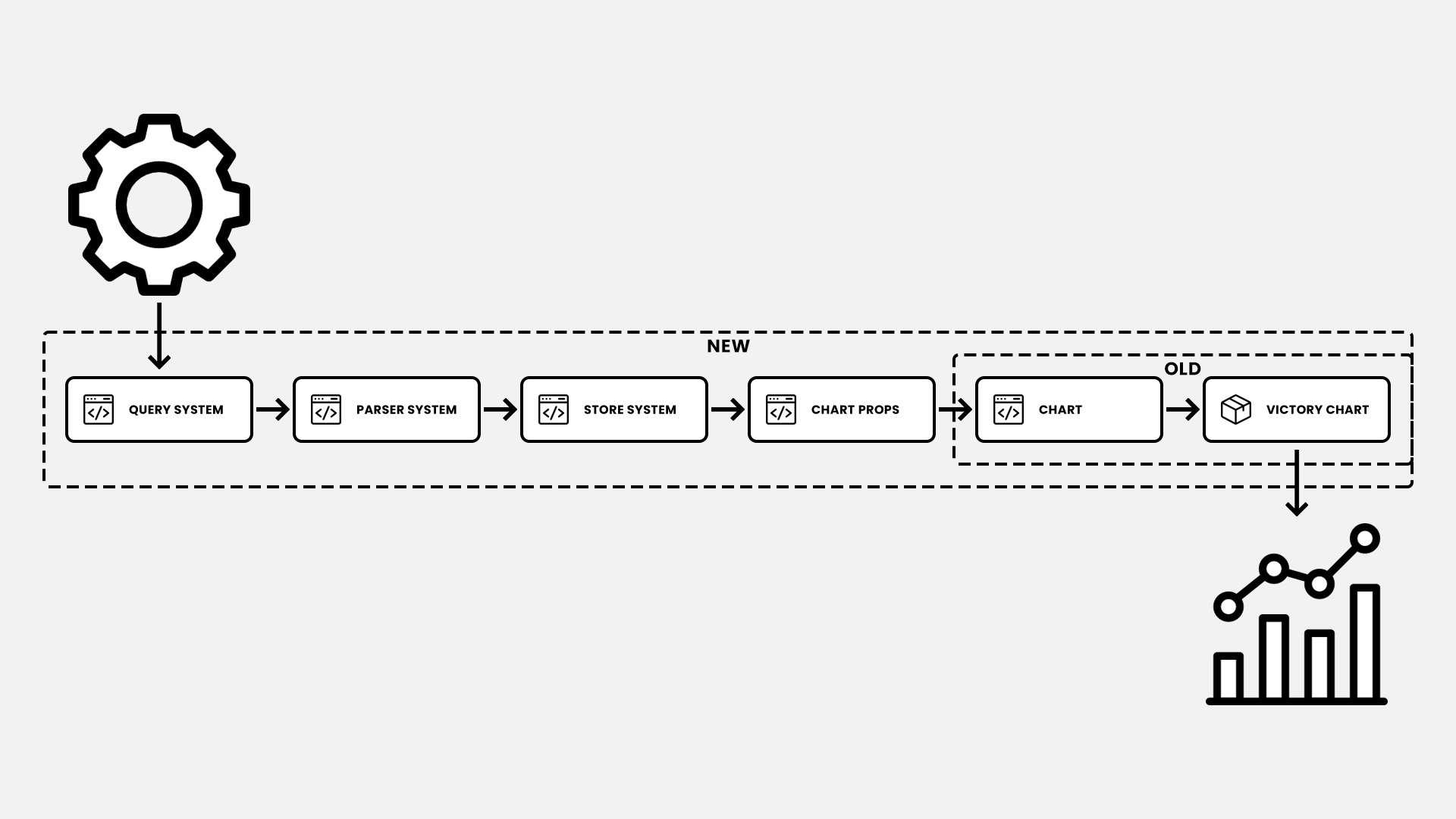
A 6-step process which given a config as input returns a chart as output
To improve on that, the idea was to encapsulate each of these steps into a reusable chunk. What's more, by designing some of these chunks as a system too, they can be reused elsewhere inside the application. This gives us the chart system, a 6-step process which given a config as input returns a chart as output.
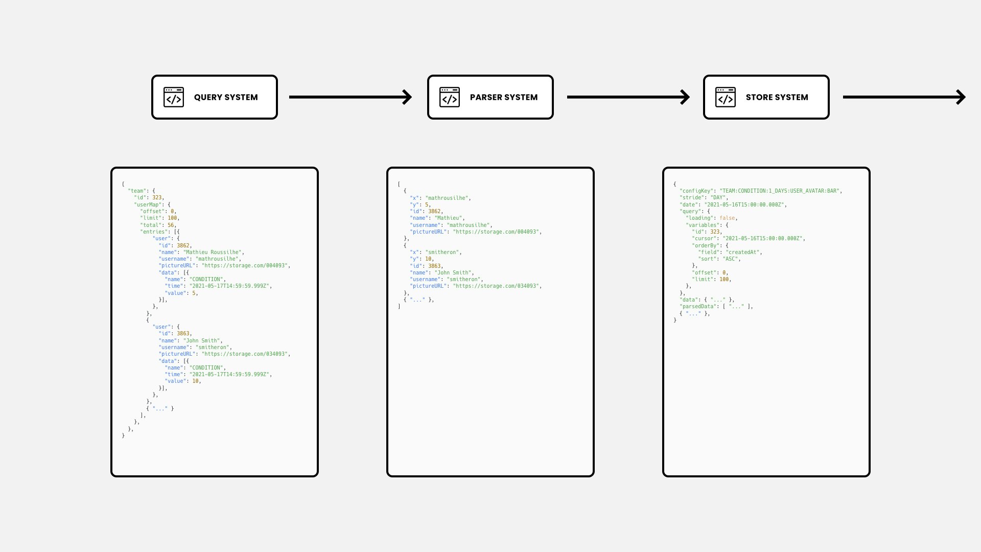
The query system integrates with Apollo, our GraphQL data fetching client. Given a query key and variables, the query system will generate and call the proper query, then return the data. Its variables can be modified anywhere down the chain, triggering a new fetch and re-rendering the chart. Since our queries are tightly coupled with our backend, the received data needs to be transformed into data compatible with the rest of the chart system. That is the role being filled by the parser system. The store system is here to centralize the system state so it can be easily accessed and modified from anywhere inside or outside of it.
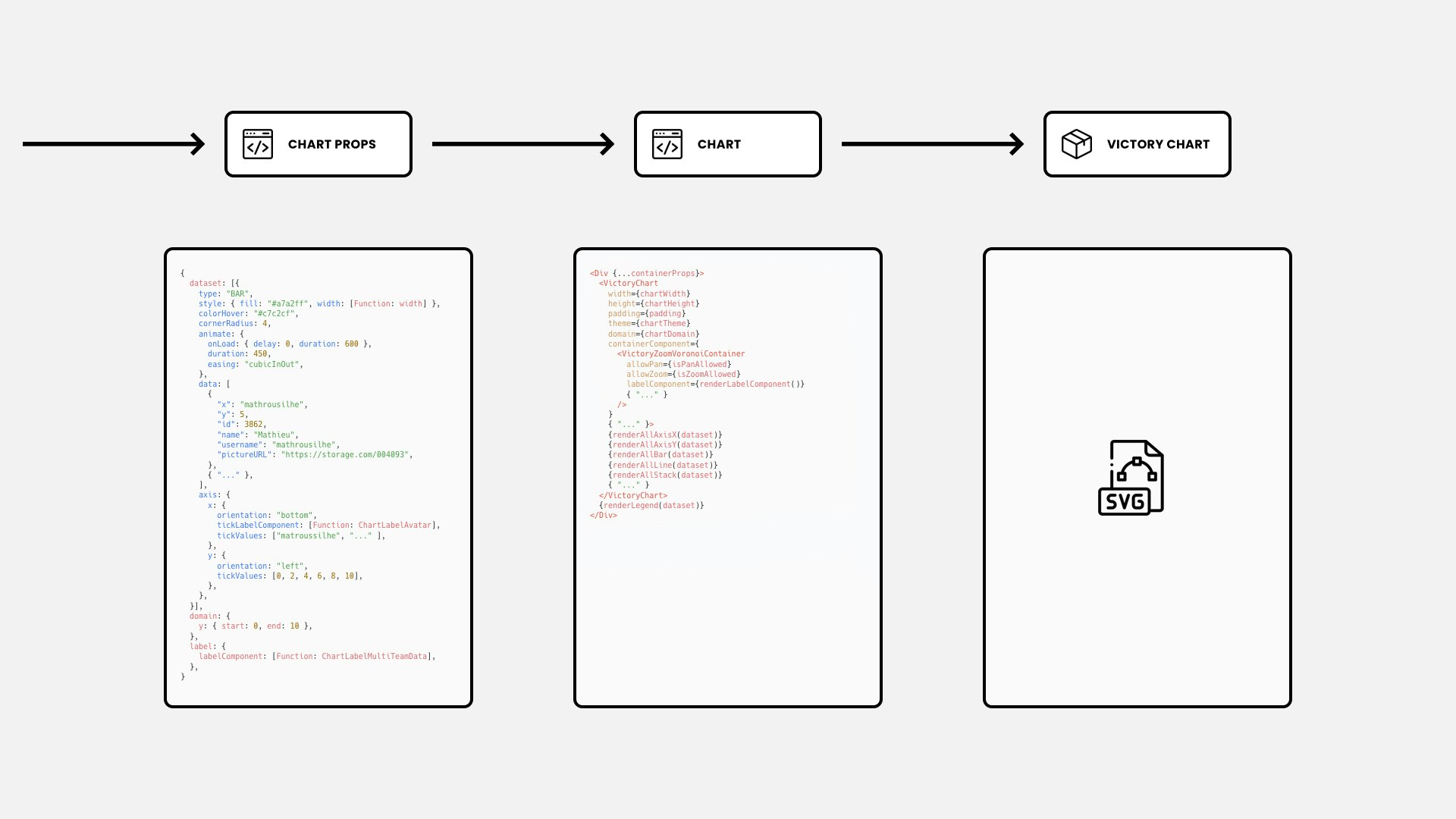
The Chart Props is the most elaborate step in the process. Its role is to generate all the properties used by the Chart and by extension the Victory library. It is a huge collection of hundreds of reusable functions related to chart axes, domain, events and more. The Chart receives 2 types of properties. The one generated in the previous step and styling properties from its parent component (e.g. chart width, height, padding). It then combines these 2 and converts them into the corresponding Victory components. The Victory Chart is the final step. The inner functioning of the library will draw vector graphics (i.e. SVG) representing different kinds of charts to accurately visualize our data.
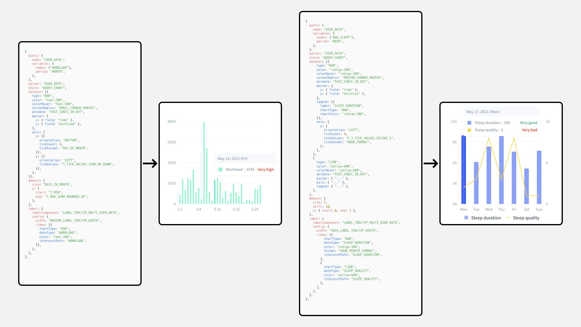
The config is highly customizable and allows just about any combination. You can request any data, mix as many different chart types as you want (e.g. bar, line, stack), display several axes, personalize appearance and even control domain navigation.
RESULT
As of today, with over 90 charts in the form of 8000 lines of config, the chart system proved to be extremely valuable. The systematic approach helped us save a tremendous amount of time, effort and code. Adding or modifying a chart is now a smooth and proven method allowing for quick iterations. The next evolution for the chart system is to allow users to create their own charts through a user-friendly config editor. As for our team the next goal is to expand the use of systems in our codebase. This can be done by relying more on the newly made systems and by applying the same philosophy to other parts of our products.